In this article we’ll walk through a simple file uploader in Rust using Leptos with Tailwindcss.
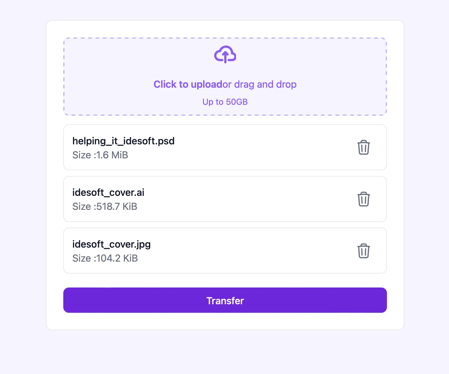
Our file uploader will have the following features:
- Drag-and-drop for file selection,
- A file input as alternative way to select files,
- A list view to display selected files
- Options to remove files from the selected list,
- A simple confirmation message.
If you are interested in the code, you can find it on GitHub: File Uploader Example.
Setting up the development environment
To start, we need to set up our environment for both Leptos and TailwindCSS.
Setting up Leptos for Client-Side Rendering (CSR)
-
Install Rust
Ensure you have Rust installed and updated to the last version. If you need guidance on installation, refer to Rust’s official documentation.
-
Install Trunk
For building and serving Leptos applications, we will use
Trunktool. Install it by running the following command:cargo install trunk -
Initialize a basic Rust project
Create a new basic project directory for our file uploader:
cargo init file-uploader-example -
Add Leptos as a dependency
Navigate into the project directory, and add
leptosas a dependency withcrsfeature enabledcargo add leptos --features=csr -
Configure WebAssembly target
Leptos requires compiling Rust to WebAssembly (Wasm) to run in the browser. Add the Wasm target with
rustup target add wasm32-unknown-unknown -
Create and HTML entry point
In the project root, create a simple
index.htmlfile with the following content.<!doctype html><html lang="en"><head><meta charset="utf-8"><meta name="viewport" content="width=device-width, initial-scale=1.0"><title>File Uploader Example</title></head><body></body></html> -
Add basic Leptos hello world to
main.rsIn the
srcfolder, openmain.rsand insert this initial code:use leptos::{component, mount_to_body, view, IntoView};#[component]fn App() -> impl IntoView {view! {<p>Hello World</p>}}fn main() {mount_to_body(App)} -
Verify project structure
Your directory structure should now look something like this:
.├── src│ └── main.rs├── Cargo.toml├── index.html -
Run the application
From the root of your project, run:
trunk serve --openThis command will compile your app, start a local server, and open your application in your default browser.
Setting up TailwindCSS
To style the file uploader interface, we will use TailwindCSS. Follow these steps to integrate it into your Leptos project.
-
Create a Tailwind configuration file
In the project root, add a
tailwind.config.jsfile with the following configuration:/** @type {import('tailwindcss').Config} */module.exports = {content: {files: ["*.html", "./src/**/*.rs"]},theme: {extend: {},},plugins: [],}This setup ensures TailwindCSS will scan both your HTML and Rust files for classes.
-
Add a CSS file for Tailwind
In the project root, create a
styles.cssfile and add the following TailwindCSS directives:@tailwind base;@tailwind components;@tailwind utilities; -
Link
styles.cssinindex.htmlAdd the
styles.csslink in the<head>section ofindex.html. To enable Trunk to usetailwindcss cli, usedata-trunk rel="tailwind-css"attribute.<!doctype html><html lang="en"><head><meta charset="utf-8"><meta name="viewport" content="width=device-width, initial-scale=1.0"><title>File Transfer Example</title><link data-trunk rel="tailwind-css" href="styles.css"></head><body></body></html>
Project architecture
To maintain a clean, organized structure and follow the single responsibility principle, we will design the project with a simple directory architecture, this will help keep each part of our application modular and manageable. We will create three main directories:
components: Contains reusable UI components that can be utilized across different parts of our application.pages: Holds the main page components, which serve as entry points for each view or route in the application.services: Houses modules dedicated to external API integration. We will implement theService Agent Patternto manage API calls and interactions with web services efficiently.
Setting up the directory structure
Create the components, pages, and services directories, each containing a mod.rs file. The mod.rs file in each directory will alow us to expose these modules to the rest of the application.
.├── Cargo.lock├── Cargo.toml├── index.html├── src│ ├── components│ │ └── mod.rs│ ├── lib.rs│ ├── main.rs│ ├── pages│ │ └── mod.rs│ └── services│ └── mod.rs├── styles.css└── tailwind.config.jsIn lib.rs, expose the submodules by adding the following code:
pub mod components;pub mod pages;pub mod services;Setting up services
Our application needs to interact with an external API to handle file uploads. In this section we will set up the dependencies and organize our services.
serde: Used to serialize and deserialize data structures, enabling us to prepare our data for API requests and handle the responses.reqwasm: A WebAssembly compatible HTTP client that allows us to send HTTP requests directly from the browser.web-sys: Provides bindings to the browser’s native File API for handling file objects.
Add these dependencies with the following commands:
cargo add web-sys --features=Filecargo add serde --features=derivecargo add reqwasmNow, set up the services module by creating the following structure within the src directory:
├── Cargo.lock├── Cargo.toml├── index.html├── src│ ├── lib.rs│ ├── main.rs│ ├── pages│ │ └── mod.rs│ └── services│ ├── mod.rs│ ├── transferer.rs│ └── types.rsIn services/mod.rs, expose the files as submodules:
pub mod transferer;pub mod types;Defining Service types
To facilitate communication with the API, we will define data types that represent the expected request and response structures. This approach allows us to serialize and deserialize data accurately when interacting with the API.
In types.rs, create the following structures:
use serde::Deserialize;
#[derive(Debug, Default, Clone)]pub struct FailureReply {    pub message: String,}
#[derive(Debug, Deserialize, Default, Clone)]pub struct BucketDetail { pub bucket_id: String,}FailureReply: Represents error messages returned from the API when a request fails.BucketDetail: Represents the response structure for successful file transfers, including thebucket_idfield, which uniquely identifies the file location.
Implementing the transfer service
Now, let’s create the main function for file transfer in transferer.rs. This function will prepare the files selected by the user, package them into a FormData, and send them as a multipart/form-data request to the API.
use web_sys::FormData;
use super::types::{BucketDetail, FailureReply};
const API_URL: &str = "./api/v1/files";
pub async fn transfer_file(files: &Vec<web_sys::File>) -> Result<BucketDetail, FailureReply> {    let form_data = FormData::new().unwrap();    for file in files.iter() {        form_data            .append_with_blob_and_filename("file", file, file.name().as_str())            .unwrap();    }
    match reqwasm::http::Request::post(&API_URL)        .body(form_data)        .send()        .await    {        Ok(res) => res            .json::<BucketDetail>()            .await            .map_err(|err| FailureReply {                message: err.to_string(),            }),        Err(err) => Err(FailureReply {            message: err.to_string(),        })?,    }}
The transfer_file function performs the following steps:
- Initialize
FormData: TheFormDataobject allows us to format files asmultipart/form-datafor API transmission. - Add files to
FormData: Each selected file by the user is appended to theFormDatainstance. - Send the HTTP request: Using
reqwasm, we send a POST request to theAPI_URL, including theFormDataas the request body. - Handle the response: We expect a successful response to contain a
BucketDetailwith abucket_id, or a failure response to return aFailureReplywith an error message.
Creating the components
To make our application modular and reusable, we will create reusable components, like icons and buttons.
Icons components
Our application requires icon components to represent some UI elements visually. We will create an icons module within the components module to organize these icons, using SVG format. You can utilize icons iconoir, heroicons or any other preferred library if desired.
To organize our icons, create the following structure within the components directory.
.├── src│ ├── components│ │ ├── icons│ │ │ │── check_icon.rs│ │ │ │── info_icon.rs│ │ │ │── mod.rs│ │ │ │── spin_icon.rs│ │ │ └── trash_icon.rs│ │ └── mod.rsThen, expose each icon in icons/mod.rs:
pub mod check_icon;pub mod info_icon;pub mod spin_icon;pub mod trash_icon;Finally, expose the icons module in components/mod.rs
pub mod icons;Check icon component
The CheckIcon component renders a checkmark icon in SVG format, allowing customization via Tailwind CSS classes. This icon can indicate successful actions.
use leptos::{component, view, IntoView};
#[component]pub fn CheckIcon(#[prop()] inner_class: &'static str) -> impl IntoView {    view! {        <svg class=inner_class class="text-green-500 h-24 w-24" xmlns="http://www.w3.org/2000/svg" fill="none" viewBox="0 0 24 24" stroke-width="1.5" stroke="currentColor">            <path stroke-linecap="round" stroke-linejoin="round" d="m4.5 12.75 6 6 9-13.5" />        </svg>    }}
This component accepts inner_class as a parameter to dynamically apply Tailwind classes, allowing for easy customization of properties like fill, color, and size.
Spin icon component
The SpinIcon component displays a rotating spinner, commonly used to indicate loading or busy states.
use leptos::{component, view, IntoView};
#[component]pub fn SpinIcon(#[prop()] inner_class: &'static str) -> impl IntoView {    view! {        <svg class=inner_class xmlns="http://www.w3.org/2000/svg" fill="none" viewBox="0 0 24 24">            <circle class="opacity-25" cx="12" cy="12" r="10" stroke="currentColor" stroke-width="4"></circle>            <path class="opacity-75" fill="currentColor" d="M4 12a8 8 0 018-8V0C5.373 0 0 5.373 0 12h4zm2 5.291A7.962 7.962 0 014 12H0c0 3.042 1.135 5.824 3 7.938l3-2.647z"></path>        </svg>    }}
Trash icon component
The TrashIcon component provides an SVG icon for delete actions.
use leptos::{component, view, IntoView};
#[component]pub fn TrashIcon(#[prop()] inner_class: &'static str) -> impl IntoView {    view! {        <svg class=inner_class xmlns="http://www.w3.org/2000/svg" fill="none" viewBox="0 0 24 24" stroke-width="1.5" stroke="currentColor">            <path stroke-linecap="round" stroke-linejoin="round" d="m14.74 9-.346 9m-4.788 0L9.26 9m9.968-3.21c.342.052.682.107 1.022.166m-1.022-.165L18.16 19.673a2.25 2.25 0 0 1-2.244 2.077H8.084a2.25 2.25 0 0 1-2.244-2.077L4.772 5.79m14.456 0a48.108 48.108 0 0 0-3.478-.397m-12 .562c.34-.059.68-.114 1.022-.165m0 0a48.11 48.11 0 0 1 3.478-.397m7.5 0v-.916c0-1.18-.91-2.164-2.09-2.201a51.964 51.964 0 0 0-3.32 0c-1.18.037-2.09 1.022-2.09 2.201v.916m7.5 0a48.667 48.667 0 0 0-7.5 0" />        </svg>    }}
Info icon component
The InfoIcon component provides an informational icon, to represent alerts.
use leptos::{component, view, IntoView};
#[component]pub fn InfoIcon(#[prop()] inner_class: &'static str) -> impl IntoView {    view! {        <svg class=inner_class xmlns="http://www.w3.org/2000/svg" fill="none" viewBox="0 0 24 24" stroke-width="1.5" stroke="currentColor">            <path stroke-linecap="round" stroke-linejoin="round" d="m11.25 11.25.041-.02a.75.75 0 0 1 1.063.852l-.708 2.836a.75.75 0 0 0 1.063.853l.041-.021M21 12a9 9 0 1 1-18 0 9 9 0 0 1 18 0Zm-9-3.75h.008v.008H12V8.25Z" />        </svg>    }}
Buttons components
Our application will includes two types of buttons: a simple text button and a button with an icon. To organize them, we will create a buttons module within the components module.
├── components│ ├── buttons│ │ ├── button.rs│ │ ├── button_icon.rs│ │ └── mod.rs│ └── mod.rs├── lib.rsThen, expose each button module in buttons/mod.rs
pub mod button;pub mod button_icon;Finally, expose the buttons module on components/mod.rs
pub mod buttons;pub mod icons;Button component
The Button component is a customizable button that can display a loading spinner, a busy label, and disable itself during an ongoing task.
use leptos::ev::MouseEvent;use leptos::{component, view, Callable, Callback, IntoView, ReadSignal, Show, SignalGet};
use crate::components::icons::spin_icon::SpinIcon;
#[component]pub fn Button(    busy_reader: ReadSignal<bool>,    #[prop(into)] on_click: Callback<MouseEvent>,    #[prop(default = "")] label: &'static str,    #[prop(default = "")] busy_label: &'static str,) -> impl IntoView {    view! {        <button            class="h-9 flex justify-center items-center space-x-4 w-full text-white bg-violet-700 hover:bg-violet-800 focus:ring-4 focus:outline-none focus:ring-violet-300 font-medium rounded-lg text-sm text-center"            disabled=move || busy_reader.get()            on:click=move |ev| {                if !busy_reader.get() {                    on_click.call(ev);                };            }>
            <Show when=move ||busy_reader.get()>            <SpinIcon inner_class="animate-spin h-5 w-5 mr-2 text-white" />            </Show>
            {move || if busy_reader.get() {                busy_label.to_string()            } else {                label.to_string()            }}        </button>    }}
The component takes the following properties:
busy_readermonitors the busy state using aReadSignal, controlling the button’s spinner, label, and disabled status.on_clickspecifies a callback function triggered upon user clicks.labelandbusy_labelspecify the displayed text in normal and busy states, respectively.
Button icon component
The ButtonIcon component is a simple button containing only an icon maintaining the same behavior of the Button component.
use leptos::ev::MouseEvent;use leptos::{component, view, Callable, Callback, IntoView, ReadSignal, SignalGet};
#[component]pub fn ButtonIcon<F, IV>(    busy_reader: ReadSignal<bool>,    #[prop(into)] on_click: Callback<MouseEvent>,    inner_icon: F,) -> impl IntoViewwhere    F: Fn() -> IV,    IV: IntoView,{    view! {        <button            disabled=move || busy_reader.get()            class="inline-flex items-center text-base font-semibold text-gray-500 cursor-pointer ml-2 p-2 rounded-full hover:text-violet-500 hover:bg-violet-100"            on:click=move |ev| {                if !busy_reader.get() {                    on_click.call(ev);                };            }>            {inner_icon()}        </button>    }}
File components
Our file components will needs the following dependencies:
human_bytesto display the file size in a human format, like1 KiB, 1024 B, 1 KB, 1000 B.
So, just use cargo to add the new dependencies.
cargo add human_bytesThen, we will need two components one to display the files selected as list, and the other one to encapsulate the behavior for a single file selected.
├── components│ ├── buttons│ │ ├── button.rs│ │ ├── button_icon.rs│ │ └── mod.rs│ ├── file│ │ ├── file_item.rs│ │ ├── file_list.rs│ │ └── mod.rs│ ├── icons│ │ ├── check_icon.rs│ │ ├── info_icon.rs│ │ ├── mod.rs│ │ ├── spin_icon.rs│ │ └── trash_icon.rs│ └── mod.rs├── lib.rsThen expose every component on file/mod.rs.
pub mod file_item;pub mod file_list;Finally, expose the file module on components/mod.rs.
pub mod buttons;pub mod file;pub mod icons;File item component
use human_bytes::human_bytes;use leptos::ev::MouseEvent;use leptos::{component, view, IntoView, ReadSignal};
use crate::components::buttons::button_icon::ButtonIcon;use crate::components::icons::trash_icon::TrashIcon;
#[component]pub fn FileItem<F>(    name: String,    size: f64,    processing_reader: ReadSignal<bool>,    on_remove: F,) -> impl IntoViewwhere    F: Fn(MouseEvent) + 'static,{    view! {        <li class="border border-gray-200 rounded-lg mb-2 p-3">            <div class="flex items-center">                <div class="flex-1 min-w-0">                    <p class="text-sm font-medium text-gray-900 truncate">                        {name}                    </p>                    <p class="text-sm text-gray-500 truncate">                        Size: {human_bytes(size)}                    </p>                </div>                <ButtonIcon                    busy_reader=processing_reader                    on_click=on_remove                    inner_icon=||view! { <TrashIcon inner_class="w-6 h-6" /> }                    >                </ButtonIcon>            </div>        </li>    }}
We use this component to display the file information like:
- File name,
- file size using
human_bytesto display the storage device sizes, - button with our trash icon to remove the selected file.
File list component
use leptos::{component, view, IntoView, SignalGet, SignalUpdate};use leptos::{For, ReadSignal, SignalSet, WriteSignal};use web_sys::File;
use crate::components::file::file_item::FileItem;
#[component]pub fn FileList(    files_reader: ReadSignal<Vec<File>>,    files_setter: WriteSignal<Vec<File>>,    transfer_pending: ReadSignal<bool>,    dropped_setter: WriteSignal<bool>,) -> impl IntoView {    view! {        <ul role="list">            <For each=move || files_reader.get() key=|f| f.name() let:file>            <FileItem                name=file.name()                size=file.size()                processing_reader=transfer_pending                on_remove=move |_| {                    files_setter.update(|files| {                        let index = files.iter().position(|f_iter| f_iter.name().eq(&file.name())).unwrap();                        files.remove(index);                    });
                    if files_reader.get().len() == 0 {                        dropped_setter.set(false);                    }                }            />            </For>        </ul>    }}
In this component we loop the files_reader parameter a ReadSignal that store the selected files and for each one we use our component FileItem.
We use the on_remove callback to remove a file, to do that we need to modify the files_setter a WriteSignal that include a update method that receive a mutable reference to the current value of the signal, so, we use to remove a file by determinate index.
Dropzone components
We need to add the following dependency to support the drag and drop, so use cargo to add the new dependency.
cargo add leptos-useThen, we will need two components one for our dropzone and another to preview the files dragged to our dropzone.
├── components│ ├── buttons│ │ ├── button.rs│ │ ├── button_icon.rs│ │ └── mod.rs│ ├── dropzone│ │ ├── dropzone_bar.rs│ │ ├── dropzone_previewer.rs│ │ └── mod.rs│ ├── file│ │ ├── file_item.rs│ │ ├── file_list.rs│ │ └── mod.rs│ ├── icons│ │ ├── check_icon.rs│ │ ├── info_icon.rs│ │ ├── mod.rs│ │ ├── spin_icon.rs│ │ └── trash_icon.rs│ └── mod.rs├── lib.rsThen expose every component on file/mod.rs.
pub mod dropzone_bar;pub mod dropzone_previewer;Finally, expose the dropzone module on components/mod.rs
pub mod buttons;pub mod dropzone;pub mod file;pub mod icons;Dropzone bar component
use leptos::{component, view, IntoView};
#[component]pub fn DropzoneBar() -> impl IntoView {    view! {        <div class="flex flex-col items-center justify-center pt-5 pb-6">            <svg class="w-8 h-8 mb-4 text-violet-500" aria-hidden="true" xmlns="http://www.w3.org/2000/svg" fill="none" viewBox="0 0 20 16">                <path stroke="currentColor" stroke-linecap="round" stroke-linejoin="round" stroke-width="2" d="M13 13h3a3 3 0 0 0 0-6h-.025A5.56 5.56 0 0 0 16 6.5 5.5 5.5 0 0 0 5.207 5.021C5.137 5.017 5.071 5 5 5a4 4 0 0 0 0 8h2.167M10 15V6m0 0L8 8m2-2 2 2"/>            </svg>            <p class="mb-2 text-sm text-violet-500">                <span class="font-semibold">                    Click to upload                </span> or drag and drop            </p>            <p class="text-xs text-violet-500">                Up to 50GiB            </p>        </div>    }}
This component will be used as a placeholder that indicate the user where is the zone to drag their files.
Dropzone previewer component
use leptos::ev::MouseEvent;use leptos::html::Label;use leptos::{    component, create_node_ref, create_signal, view, Callable, Callback, IntoView, ReadSignal,    Show, SignalGet, SignalSet, SignalUpdate, WriteSignal,};use leptos_use::{use_drop_zone_with_options, UseDropZoneOptions, UseDropZoneReturn};use web_sys::wasm_bindgen::JsCast;use web_sys::{js_sys, Event, File, HtmlInputElement};
use crate::components::buttons::button::Button;use crate::components::dropzone::dropzone_bar::DropzoneBar;use crate::components::file::file_list::FileList;
#[component]pub fn DropzonePreview(    files_reader: ReadSignal<Vec<File>>,    files_setter: WriteSignal<Vec<File>>,    transfer_pending: ReadSignal<bool>,    #[prop(into)] on_transfer: Callback<MouseEvent>,) -> impl IntoView {    let (dropped, set_dropped) = create_signal(false);
    let drop_zone_el = create_node_ref::<Label>();
    let UseDropZoneReturn {        is_over_drop_zone: _,        files: _,    } = use_drop_zone_with_options(        drop_zone_el,        UseDropZoneOptions::default()            .on_drop(move |ev| {                files_setter.update(move |f| *f = ev.files);                set_dropped.set(true);            })            .on_enter(move |_| set_dropped.set(false)),    );
    let on_change_file = move |ev: Event| {        ev.stop_propagation();
        let input_file_el = ev            .target()            .unwrap()            .dyn_ref::<HtmlInputElement>()            .unwrap()            .clone();
        let selected_files: Vec<File> = input_file_el            .files()            .map(|f| js_sys::Array::from(&f).to_vec())            .unwrap_or_default()            .into_iter()            .map(web_sys::File::from)            .collect();
        files_setter.update(move |f| *f = selected_files);        set_dropped.set(true);    };
    view! {        <div class="w-full max-w-lg p-3 bg-white border border-gray-200 rounded-lg md:p-6 sm:p-2">            <div class="drop_zone_file_container">                <label node_ref=drop_zone_el                    for="drop_zone_input"                    class="flex flex-col items-center justify-center w-full h-28 border-2 border-violet-300 border-dashed rounded-lg cursor-pointer bg-violet-50 hover:bg-violet-100">                    <DropzoneBar />                </label>
                <input id="drop_zone_input"                    class="hidden"                    type="file"                    multiple                    on:change=on_change_file />
                <Show when=move ||dropped.get()>                <div class="flow-root mt-3">                    <FileList                        files_reader=files_reader                        files_setter=files_setter                        transfer_pending=transfer_pending                        dropped_setter=set_dropped                    />                </div>                </Show>

<Show when=move ||dropped.get()> <div class="mt-3"> <Button label="Transfer" busy_label="Transferring..." busy_reader=transfer_pending on_click=move |ev| { on_transfer.to_owned().call(ev); }/> </div> </Show> </div> </div> }}- At the mark 1, we use use_drop_zone to create a zone where files can be dropped, connected to the
drop_zone_elthat is used on a<label>tag where is placed ourDropzoneBarplaceholder component.
Every time, when files are dropped on the label tag the signal dropped is notified and we can display the FileList component at the mark B and a Button to start the transferring processing at the mark G.
- At the mark 2, we use a
on:changehandler connected to the input with iddrop_zone_inputwith amultipleproperty to accept multiple selected files, so when the input change this handler is invoked.
In this handler, we get the HtmlInputElement from the event target with ev.target().unwrap().dyn_ref::<HtmlInputElement>() from this we can access to the files, but we need to convert to a Vec<File> to store on our files_setter variable that is WriteSignal<Vec<File>> where we store the selected files.
To explain this process we can write in a declarative mode.
let selected_files: Vec<File> = {    let input_files: Option<web_sys::FileList> = input_file_el.files();
    let input_values: Vec<JsValue> = input_files        .map(|f: web_sys::FileList| js_sys::Array::from(&f).to_vec())        .unwrap_or_default();
input_values.into_iter().map(web_sys::File::from).collect()};- At the mark a, we access to
web_sys::FileListwithfiles()method. - At the mark b, because
input_filesvariable is an optional we can usemapto transform the value if exist, we usejs_sys::Array::fromto convert the file list to aVec<JsValue>. - At the mark c, now is easy convert a
JsValueto aweb_sys::Fileusing thefromfactory.
Whit this three steps we convert a native HtmlInputElement to Vec<File>, and store in our files_setter signal using files_setter.update(move |f| *f = selected_files) with automatic notifications to all subscribers.
Messages components
Our application should need to display a message when the transfer is completed and another when something went wrong.
├── components│ ├── buttons│ │ ├── button.rs│ │ ├── button_icon.rs│ │ └── mod.rs│ ├── dropzone│ │ ├── dropzone_bar.rs│ │ ├── dropzone_previewer.rs│ │ └── mod.rs│ ├── file│ │ ├── file_item.rs│ │ ├── file_list.rs│ │ └── mod.rs│ ├── icons│ │ ├── check_icon.rs│ │ ├── info_icon.rs│ │ ├── mod.rs│ │ ├── spin_icon.rs│ │ └── trash_icon.rs│ ├── messages│ │ ├── mod.rs│ │ ├── transfer_complete.rs│ │ └── transfer_failed.rs│ └── mod.rs├── lib.rsThen expose every component on messages/mod.rs.
pub mod transfer_complete;pub mod transfer_failed;Finally, expose the messages module on components/mod.rs
pub mod buttons;pub mod dropzone;pub mod file;pub mod icons;pub mod messages;Transfer complete component
use leptos::{component, create_signal, view, IntoView};use web_sys::MouseEvent;
use crate::components::{buttons::button::Button, icons::check_icon::CheckIcon};
#[component]pub fn TransferComplete<F>(on_continue: F) -> impl IntoViewwhere    F: Fn(MouseEvent) + 'static,{    let (busy_reader, _) = create_signal(false);
    view! {        <div class="w-full max-w-lg p-3 bg-white border border-gray-200 rounded-lg md:p-6 sm:p-2">            <div class="flex flex-col items-center gap-y-8">                <CheckIcon inner_class="text-green-500 h-24 w-24" />
                <div class="flex flex-col items-center">                    <div>Upload complete</div>                    <div>Your files have been uploaded successfully.</div>                </div>
                <Button                    busy_reader=busy_reader                    on_click=on_continue                    label="Continue" />            </div>        </div>    }}
This is a simple component to show when the transferring file have been process successfully.
Transfer failed component
use leptos::{component, create_signal, view, IntoView};use web_sys::MouseEvent;
use crate::components::{buttons::button::Button, icons::info_icon::InfoIcon};
#[component]pub fn TransferFailed<F>(on_try_again: F) -> impl IntoViewwhere    F: Fn(MouseEvent) + 'static,{    let (busy_reader, _) = create_signal(false);
    view! {        <div class="w-full max-w-lg p-3 bg-white border border-gray-200 rounded-lg md:p-6 sm:p-2">            <div class="flex flex-col items-center gap-y-8">                <InfoIcon inner_class="h-24 w-24 text-rose-500" />
                <div class="flex flex-col items-center">                    <div>Upload failed</div>                    <div>Sorry! Something went wrong.</div>                </div>
                <Button                    busy_reader=busy_reader                    on_click=on_try_again                    label="Try again" />            </div>        </div>    }}
This is a simple component to show when something went wrong, like API is down, or any problem happen on the server.
Creating the main page
Before we are create all the components and service to integrate in our page to interact with the user, so create a new component transfer_page to our main page inside your pages directory, and include them in your mod.rs file.
├── lib.rs├── main.rs├── pages│ ├── mod.rs│ └── transfer_page.rsThen expose the component on pages/mod.rs.
pub mod transfer_page;In our transfer page we need to include all the previous components.
use leptos::{component, create_action, create_signal, view, IntoView, Show, SignalGet, SignalSet};use web_sys::{File, MouseEvent};
use crate::{    components::{        dropzone::dropzone_previewer::DropzonePreview,        messages::{transfer_complete::TransferComplete, transfer_failed::TransferFailed},    },    services,};
#[component]pub fn TransferPage() -> impl IntoView {    let (files_reader, files_setter) = create_signal(Vec::<File>::new());
    let transfer_action = create_action(|files: &Vec<File>| {        let selected_files = files.to_owned();        async move { services::transferer::transfer_file(&selected_files).await }    });    let transfer_pending = transfer_action.pending();    let transfer_reply = transfer_action.value();
    view! {        <div class="flex items-center justify-center w-full p-2 md:p-8">            <Show when=move || transfer_reply.get().is_none()>            <DropzonePreview                files_reader=files_reader                files_setter=files_setter                transfer_pending=transfer_pending                on_transfer=move |ev: MouseEvent| {                    ev.prevent_default();                    transfer_action.dispatch(files_reader.get());                } />            </Show>
            <Show when=move || transfer_reply.get().is_some()>
                <Show when=move || transfer_reply.get().unwrap().is_ok()>                <TransferComplete                    on_continue=move |ev: MouseEvent| {                        ev.prevent_default();                        transfer_reply.set(None);                    } />                </Show>
<Show when=move || transfer_reply.get().unwrap().is_err()> <TransferFailed on_try_again=move |ev: MouseEvent| { ev.prevent_default(); transfer_reply.set(None); } /> </Show> </Show> </div> }}- At the mark 1 we define an action to invoke when the
on_transfercallback is invoked with thetransfer_action.dispatch, this action invokeservices::transferer::transfer_filefunction in a async mode.
From our action we can get a signal when is busy with .pending() that we use to notify to disable our buttons or display an appropriately message. Or we can get the response with .value() to display our messages one when is ok at the mark c or when something went wrong at the mark d.
Finally, to visualize our new component, we need to include inside the App component to mount in the body of the page.
use file_transfer_tutorial::pages::transfer_page::TransferPage;use leptos::{component, mount_to_body, view, IntoView};
#[component]fn App() -> impl IntoView {    view! {        <div class="min-w-screen min-h-screen bg-violet-50">            <TransferPage />        </div>    }}
fn main() {    mount_to_body(App)}
Conclusions
In this article, we saw how to build a fully functional file uploader application using Leptos, a framework for creating web applications in Rust. By breaking down the components and logic into modular pieces, we created a clean and maintainable codebase.
Key takeaways include:
- Organizing components into a clear directory structure for better maintainability
- Leveraging Leptos’ signals and actions for state management
- Using web-sys and other Rust crates to interface with browser APIs
- Building reusable UI components using Tailwind CSS for styling
The end result demonstrates how Rust and Leptos can be used to create robust web applications with excellent developer experience and type safety. The modular architecture also makes it easy to extend the application with additional features in the future.